Top 6 Effective Website Design Tips for E-commerce Stores

- Published on
Proven Website Design Tips for Ecommerce Stores
At Devkind, we believe that great website design is more than aesthetics. It’s about effective communication that boosts conversions, builds trust, and provides a seamless user experience. With years of experience guiding ecommerce brands, we’ve distilled key tips to help you create a site that works beautifully for your customers and your business.
What are the elements of effective website design?
Great website design hinges on the interaction of six vital elements, which we emphasize for Devkind clients:
- Accessibility
- Color Palette
- Images and Video
- Functionality
- Navigation
- Typography
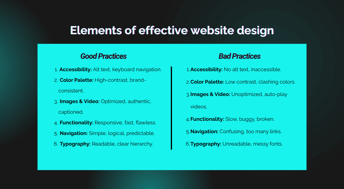
1. Accessibility
Accessibility is not just a legal concern; it’s essential for a superior user experience. Designing with accessibility in mind ensures everyone, including neurodivergent users, can navigate and engage comfortably. Simple steps like adding alt text to images improve SEO and compliance with standards, creating a welcoming site for all visitors.
Consider color contrast, keyboard navigation, screen reader compatibility, and clear error messages. Use tools to audit your site’s accessibility and aim for W3C compliance to reach the broadest possible audience.
2. Color Palette
Your color choices set the tone and usability of your site. We recommend high-contrast, yet brand-consistent palettes with off-whites or softer blacks for backgrounds to reduce eye strain, while using your brand colors strategically to highlight key elements without overwhelming visitors.
Colors evoke emotions and guide users; blues often convey trust, reds create urgency, while greens suggest eco-friendliness. Choose colors aligned with your brand’s personality and audience expectations.
3. Images and Video
Visual content brings your brand to life. Standardize product photography for a cohesive catalog look, then use lifestyle images and videos to tell your brand’s story and build trust, especially with social proof elements like endorsements or user-generated content.
Compress media to optimize load times, provide captions and alternative text, and use fallback images in place of videos on slow connections. Authentic, high-quality visuals can improve conversions and reduce return rates.
4. Functionality
A beautiful design means nothing without flawless functionality. Every element should be tested for its impact on site speed and user experience. Responsive, mobile-first design ensures a smooth experience for the majority of today’s mobile shoppers.
Optimize images, minimize heavy scripts, and use asynchronous loading to prioritize essential content. Ensure interactive elements and the checkout process work flawlessly across devices.
5. Navigation
Navigation should minimize friction, simple, predictable pathways help users find what they want quickly. Common conventions like placing the cart icon in the top-right corner meet user expectations and improve usability without reinventing the wheel.
Logical categorization, search bars with predictive and filtered search, and breadcrumb trails enhance discoverability and site orientation. For stores with large inventories, robust search capabilities are critical.
6. Typography
Typography shapes how your message is received. Choose 1-2 complementary typefaces designed for readability, using font weight and size to create a clear hierarchy that guides attention naturally through your content.
Avoid overcrowding text styles and maintain consistent spacing. Consider mobile legibility, line length, and contrast to optimize reading comfort.
Essential web design tips
- Balance the Familiar with the Unexpected
- Let Fonts Earn Their Place
- Simplify to Amplify
- Make Text Easy to Digest
- Skip the Sterile White
- Plan for the Bumps in the Road
Balance the Familiar with the Unexpected
People love a good pattern. When a website feels familiar, it’s because it’s built on repeated design patterns our brains recognize without even thinking. For ecommerce stores, this often means placing key elements where users expect to find them, like that trusty shopping cart icon chilling at the top-right corner, or navigation menus where the eye naturally looks.
Following these design “rules” isn’t just about tradition, it helps new visitors confidently explore your store without second guessing where to click.
But beware of the “sea of sameness.” When every site looks nearly identical, your brand risks blending into the crowd and losing personality. That’s where your unique touches come in. Whether it’s a distinctive font, vibrant photography, or a bold splash of your brand colors, these elements give your site character while keeping it easy to navigate.
Let Fonts Earn Their Place
Not all fonts are created equal and especially when it comes to online shopping. Fonts used for calls-to-action or product details need to be clear, crisp, and easy on the eyes. If your text feels like a chore to read, visitors won’t stick around.
On the flip side, large headlines or banners are your playground for creativity. Feel free to sprinkle in more flair here to catch attention as long as the message stays readable.
Simplify to Amplify
Less truly is more when it comes to fonts and colors. A handful of well-chosen fonts can create a polished look, while too many confuse and distract.
Take Klur, a skincare brand that pairs a straightforward sans serif font with a quirky monospaced font for headers. The contrast adds personality while keeping the text legible.
Similarly, limit your color palette. Two or three complementary colors will make your site pop without overwhelming visitors.

Source: Klur
Make Text Easy to Digest
Long lines of text scrolling across wide screens make reading a slog. Split your pages with columns or images so the eye can easily jump shorter distances.
This is why many product pages place images on one side and text on the other, it’s a simple trick to keep shoppers engaged and comfortable.
Skip the Sterile White
Bright, pure white backgrounds might seem clean, but on glowing screens, they’re often harsh on the eyes.
Softer off-white shades or gentle greys provide a calming backdrop that’s easier to look at for longer periods, nudging your shoppers to stay just a little longer.
Plan for the Bumps in the Road
Your users aren’t always on blazing fast Wi-Fi. Imagine shopping mid-flight or on a slow mobile network with limited data.
Make sure your site can handle these “worst-case” scenarios gracefully. Lazy-load images, offer static fallback content where videos might lag, and turn off auto-playing elements on mobile to save bandwidth.
By thinking through these real-world conditions, you’ll keep your store friendly and accessible no matter where or how someone’s shopping.
Frequently Asked Questions
Don't just read.
Let's work together. Build smarter.
About the Author
Hira Ishaque
Shopify B2B & Content Strategist
Hira Ishaque is a Shopify B2B and Content Strategist at Devkind, currently completing Shopify Academy's B2B Launch and Customization Assessment. Her expertise spans dedicated vs blended B2B storefront selection, buyer access configuration, catalog management, and custom pricing strategies on Shopify. She also leads content and SEO strategy for ecommerce brands, combining technical Shopify knowledge with conversion-oriented messaging. Hira writes about B2B ecommerce, SEO tools, and website design best practices.
Recent Blog Posts

AI Engineer Melbourne 2026: What It Means for Your Shopify Store
Shopify AI-referred traffic has grown 15x since early 2025. Here's what AI Engineer Melbourne 2026 means for your store and how to act before the shift accelerates.

Furniture Ecommerce Checkout Is Broken — The Project Cart Is the Fix
Furniture brands lose up to 86% of shoppers at checkout. Learn why generic store templates fail the furniture category and how the project cart model fixes it.

Shopify POS Australia: Complete Guide for Retailers in 2026
Australia's POS market is growing at 12.48% CAGR. Here's everything Australian retailers need to know about Shopify POS: pricing, hardware, 2026 features, and real results.

B2B on Shopify Australia: Complete Guide to Selling Wholesale in 2026
Everything Australian wholesalers need to know about Shopify B2B — Standard vs Plus, pricing, payment terms, storefronts, and setup.